🏰

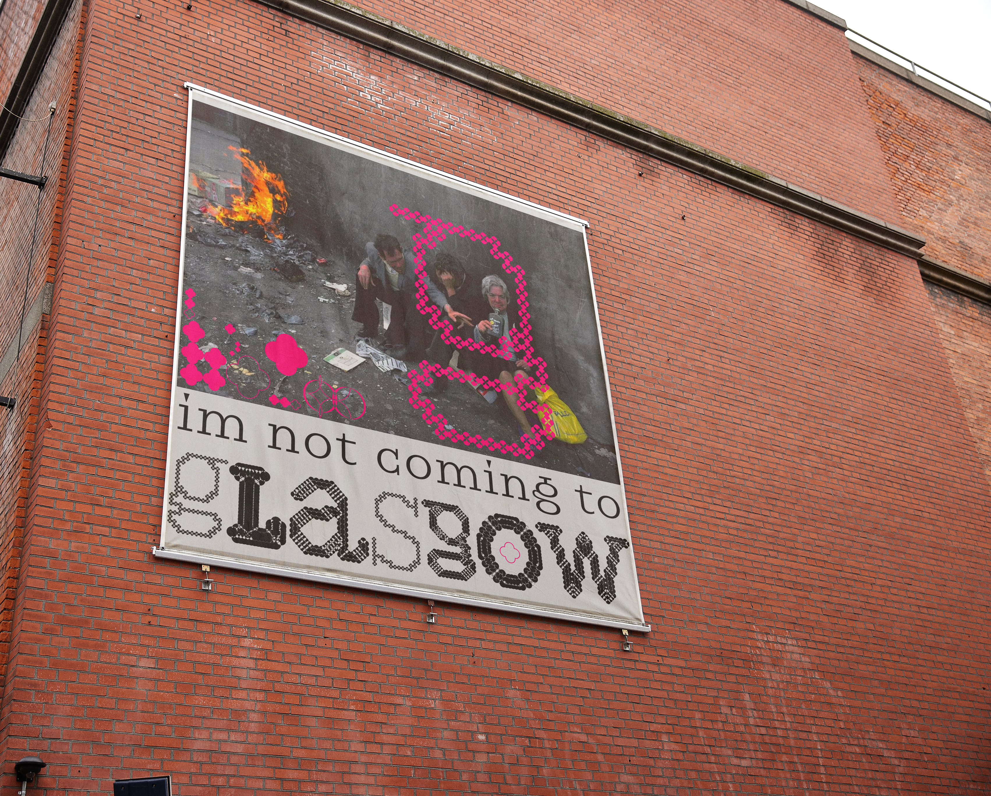
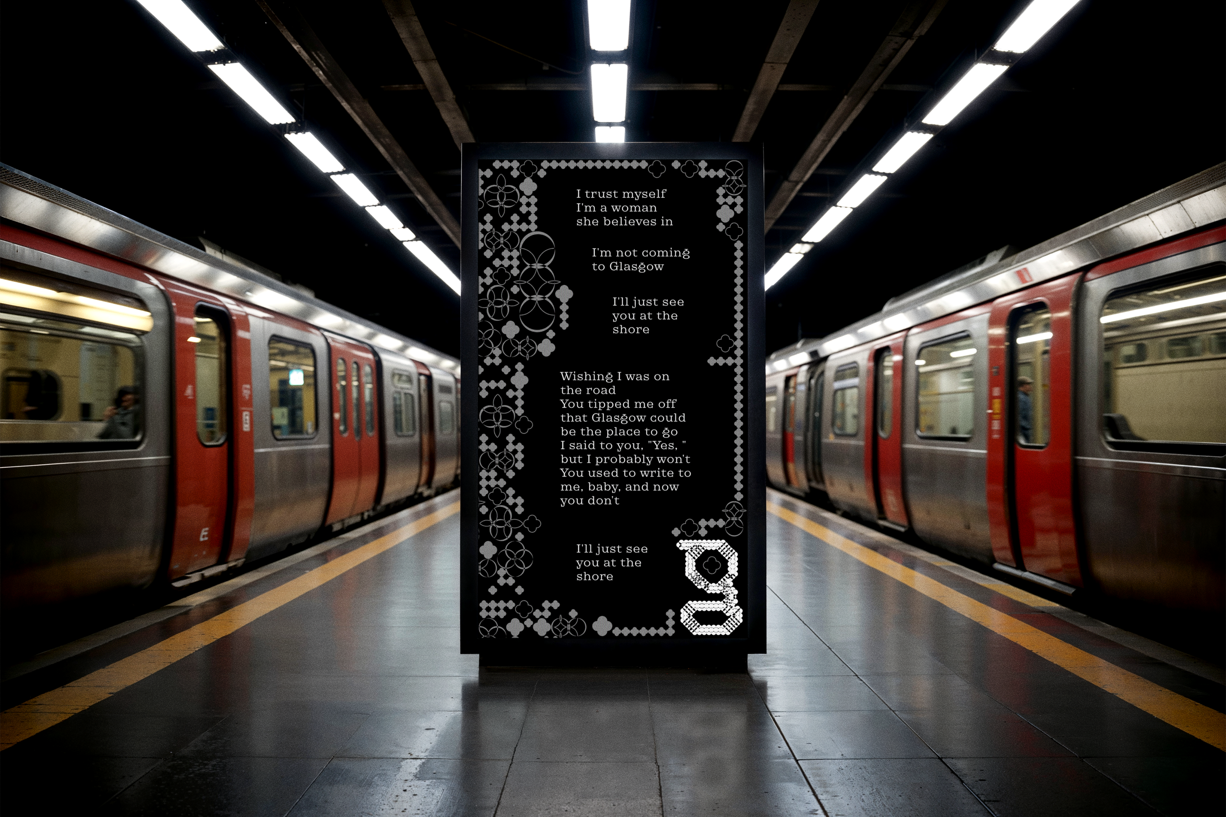
Im not coming to Glasgow
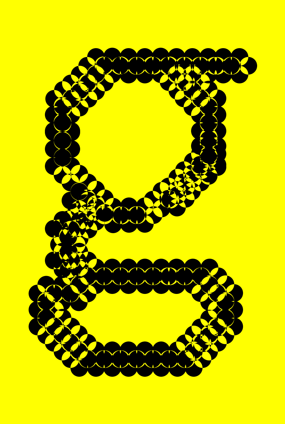
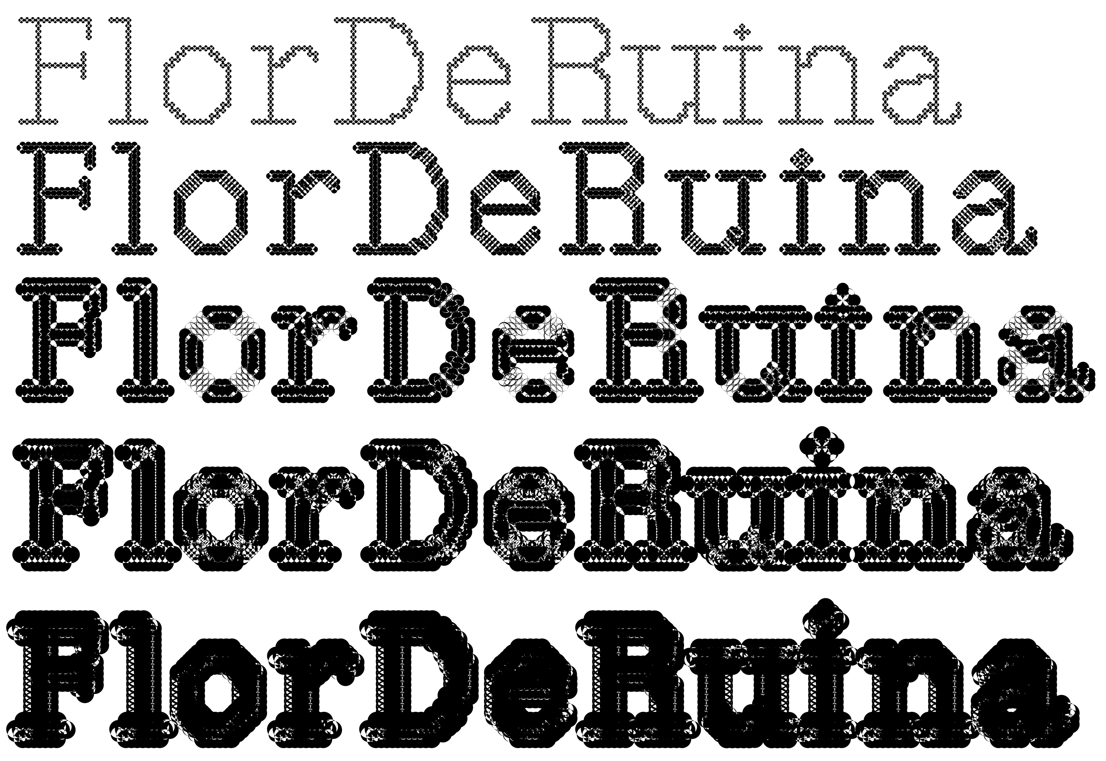
my most researched project yet.
listened to "Glasgow" by Jockstrap all day every day for two weeks (inspiring the project title).
the song was so inspiring to me, that i wanted to encapture the feeling of the song, in the dynamic visual identity for the city of glasgow.
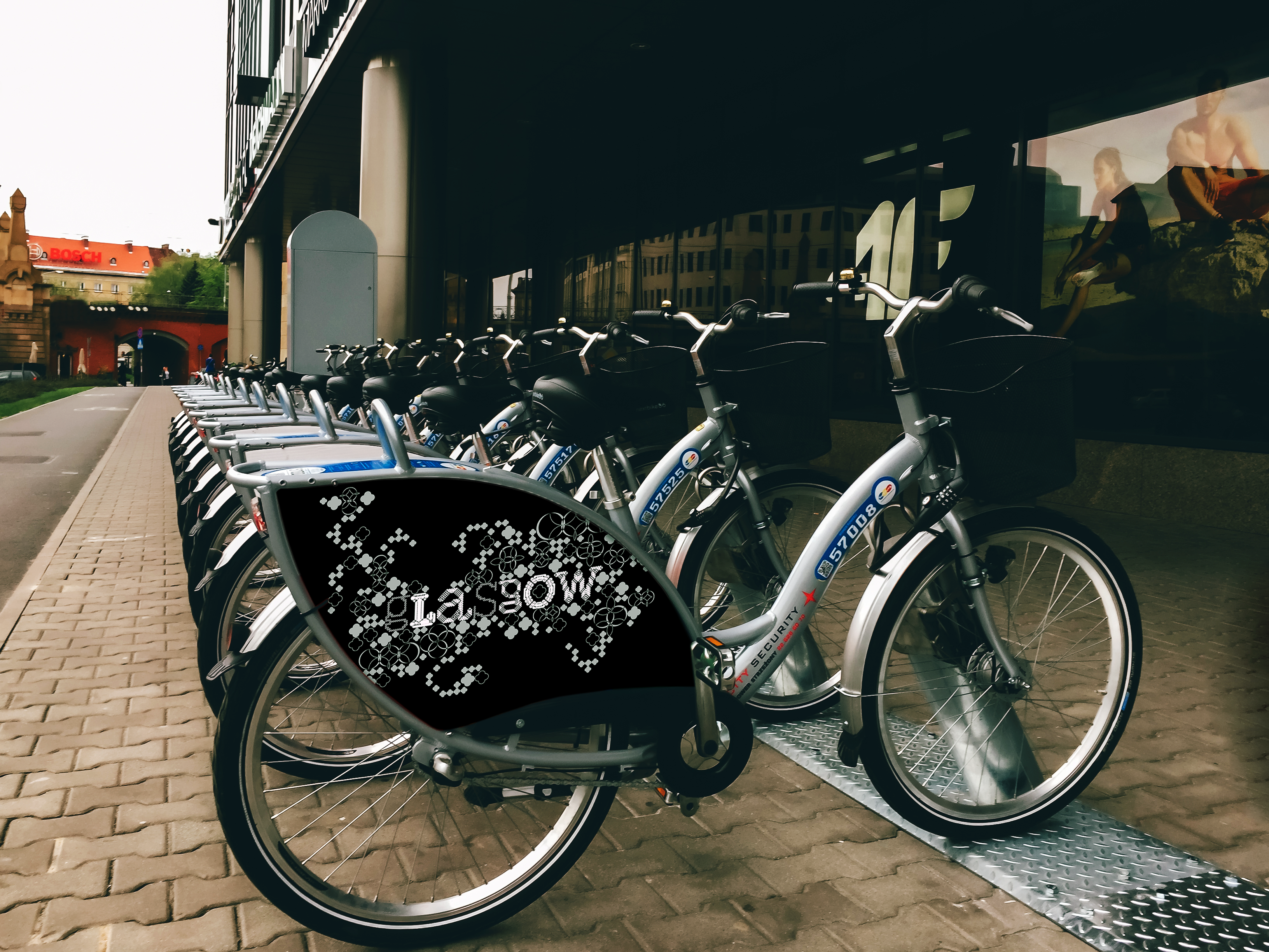
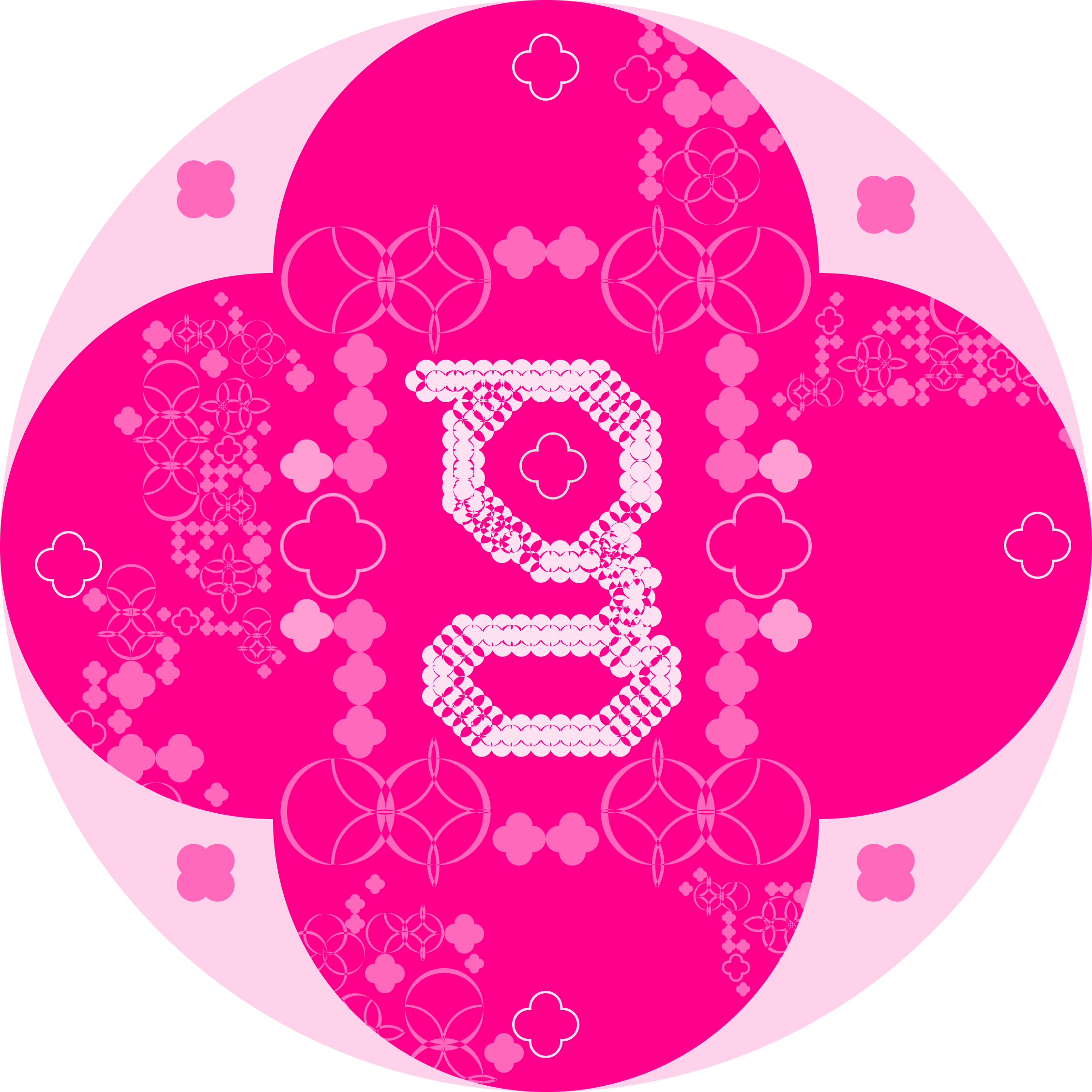
a dynamic visual identity
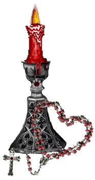
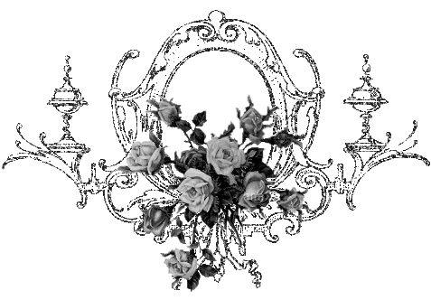
the inspo :
very medieval, very punk, very raw & very beautifully ornamented.
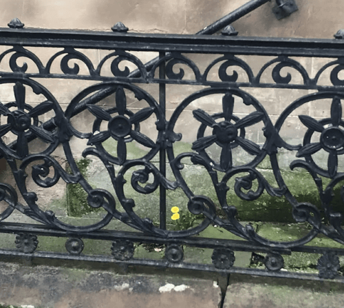
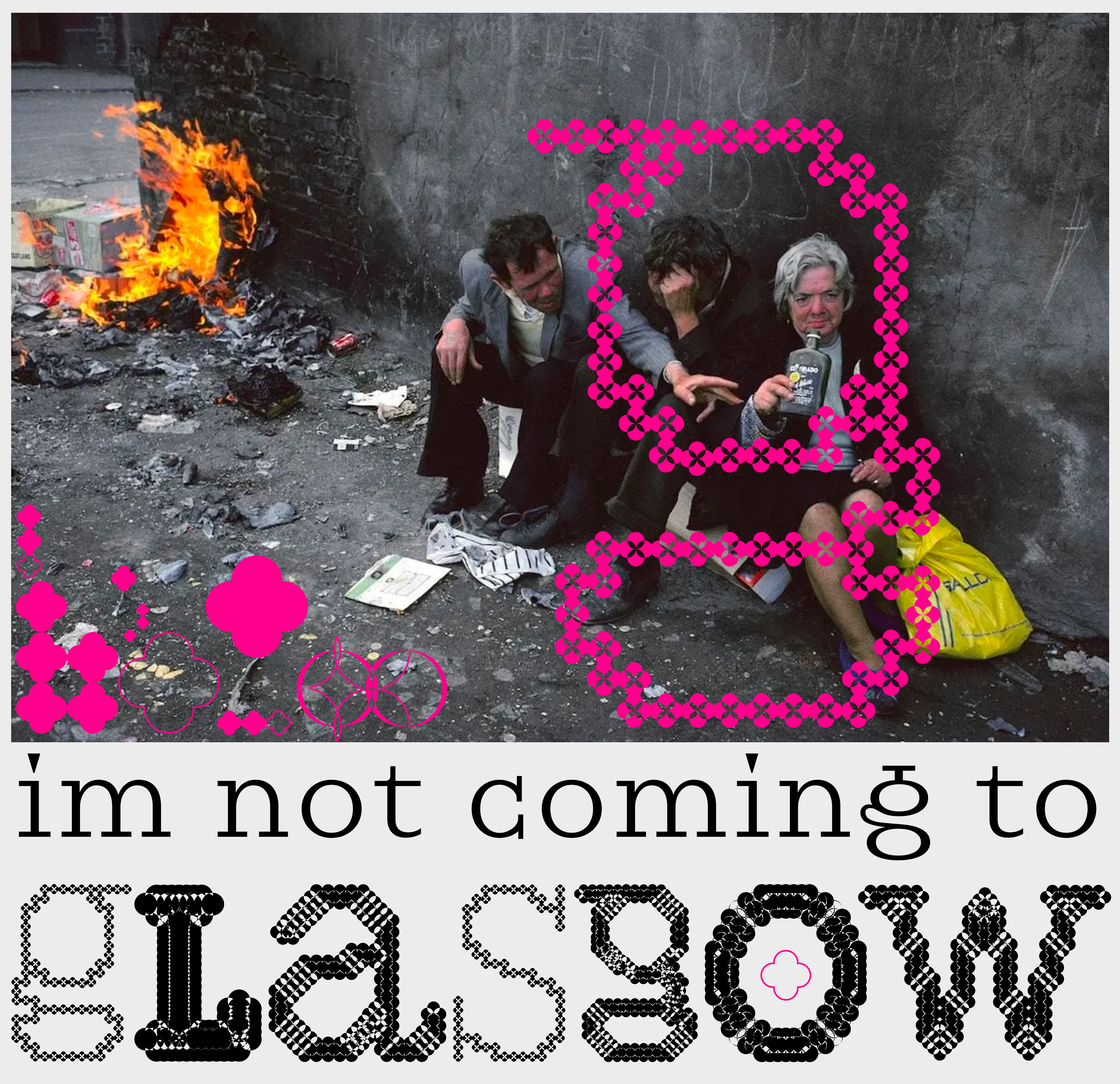
i like how gray and industrial glasgow looks from the outside, contrasting the stunning gothic architechture.
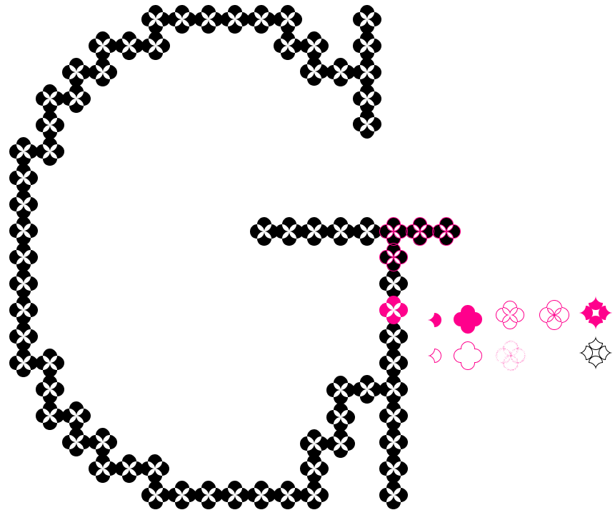
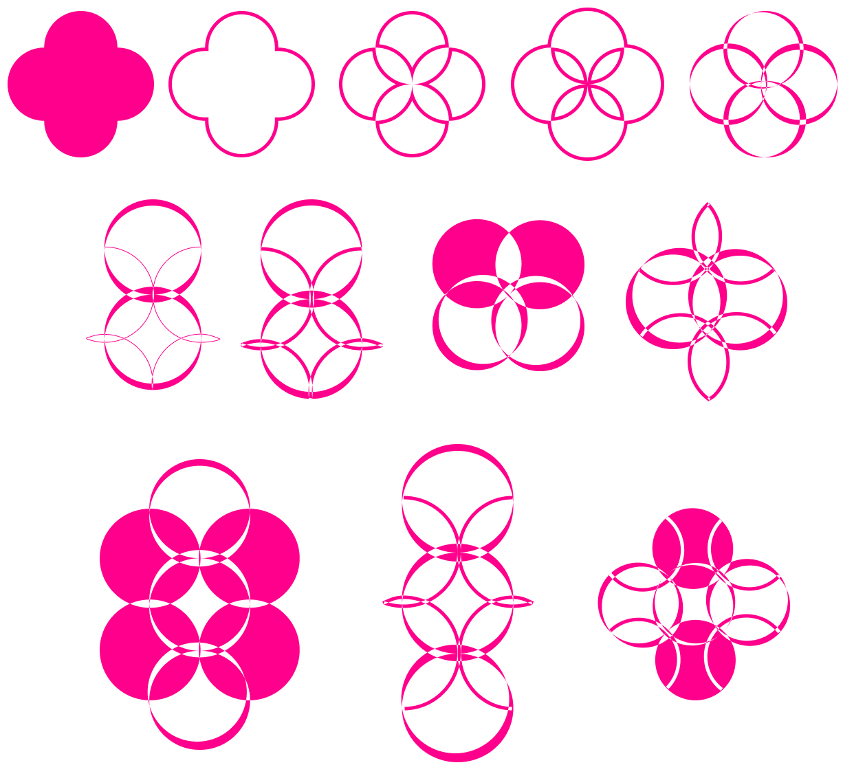
the results :
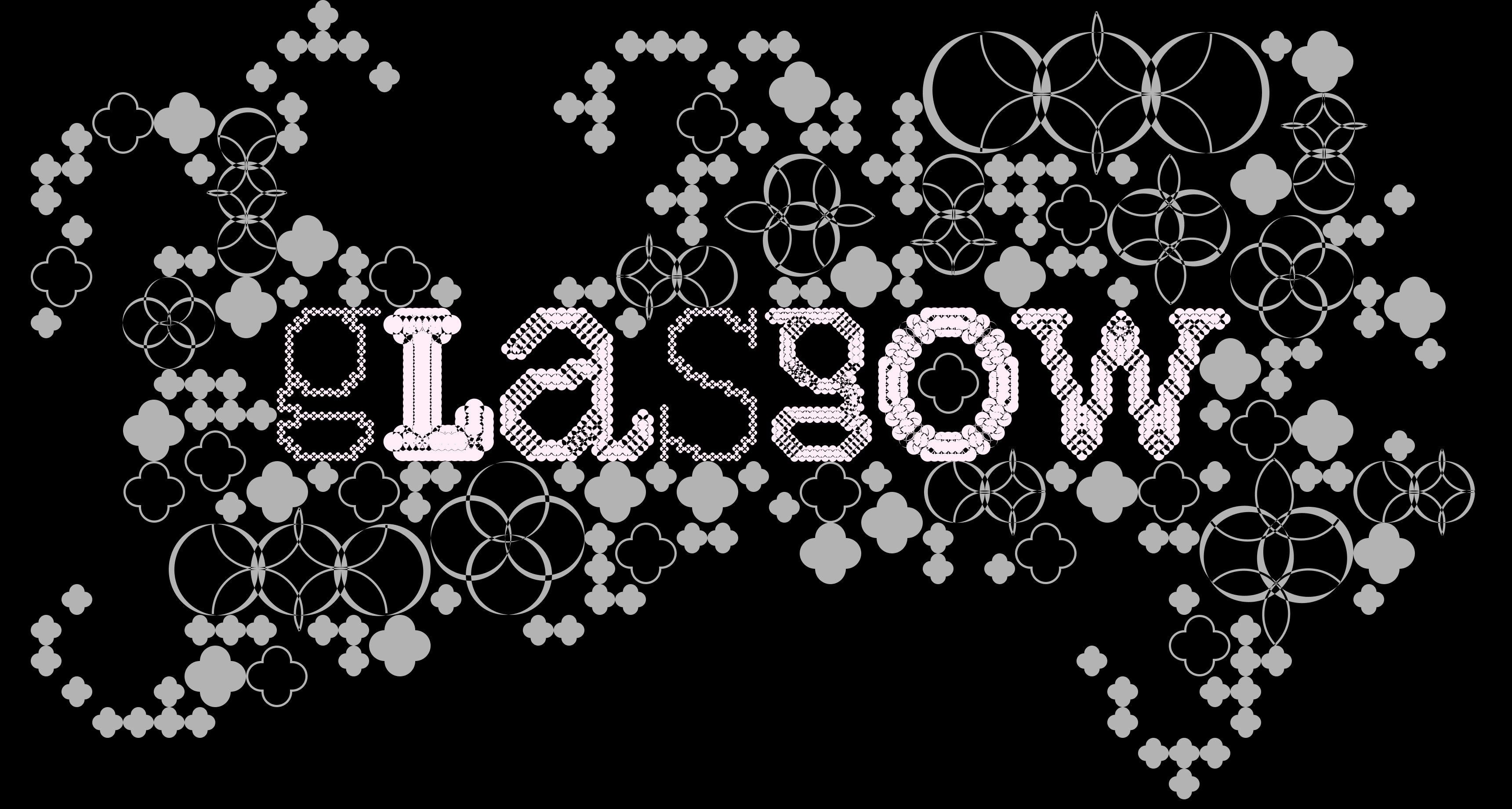
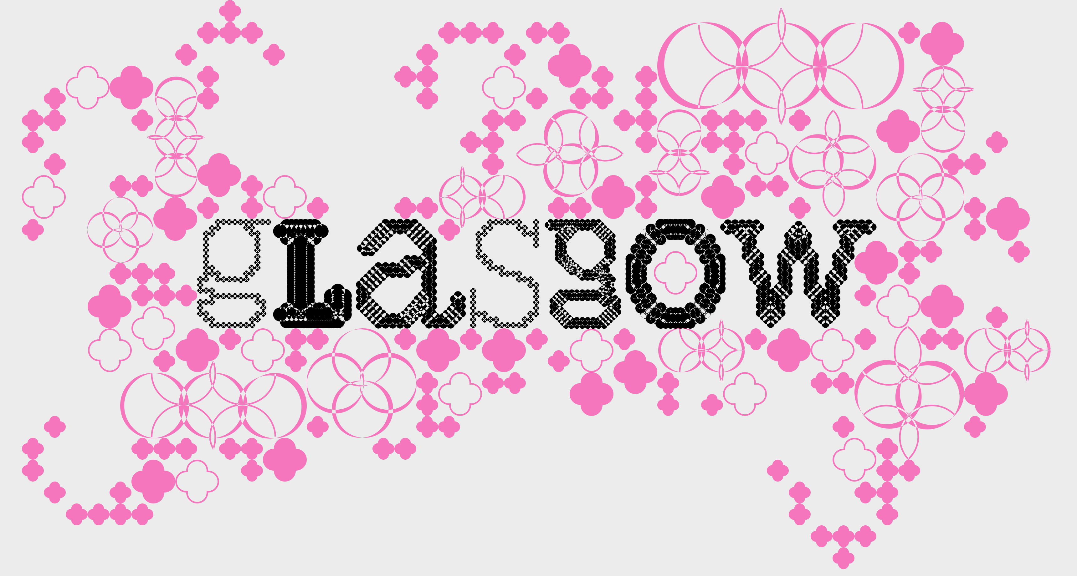
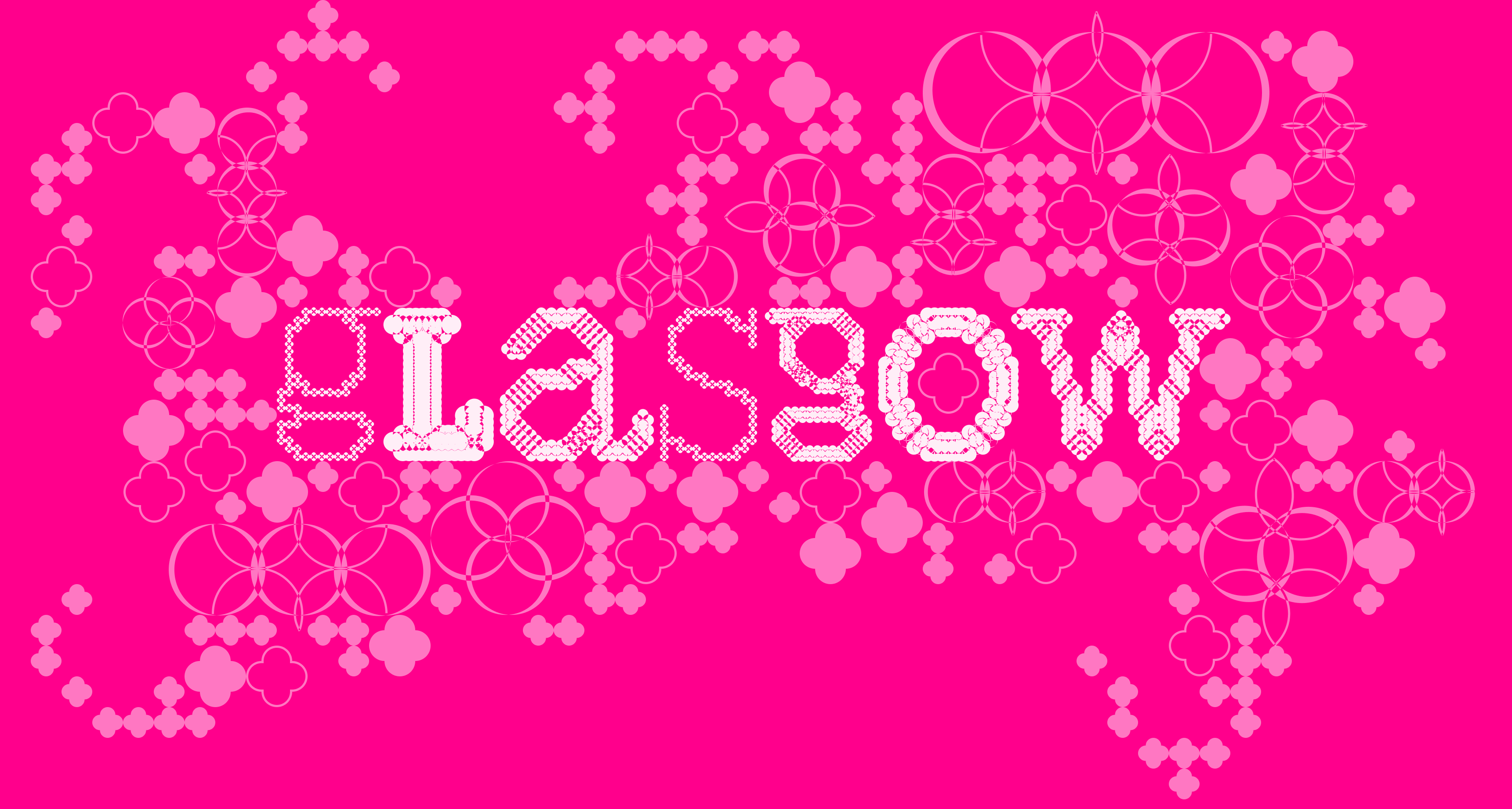
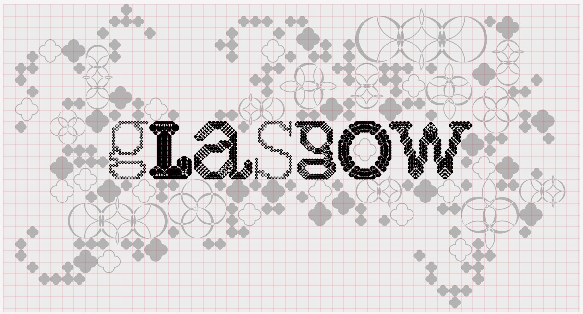
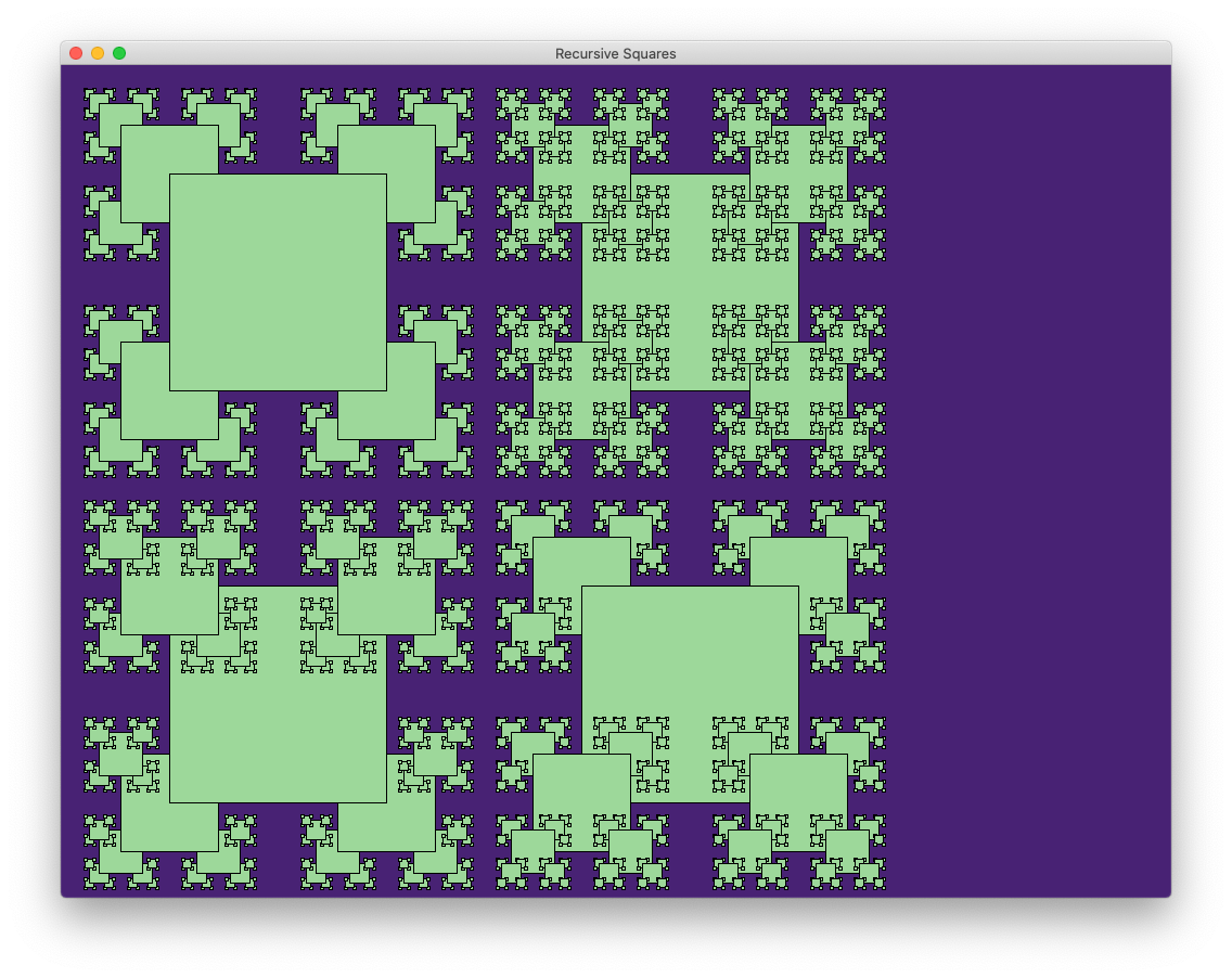
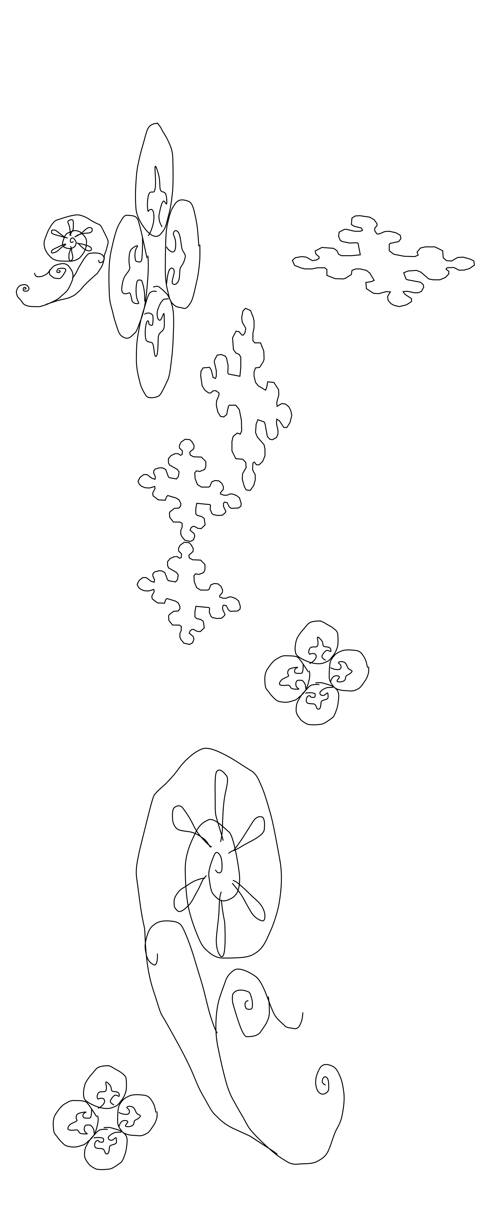
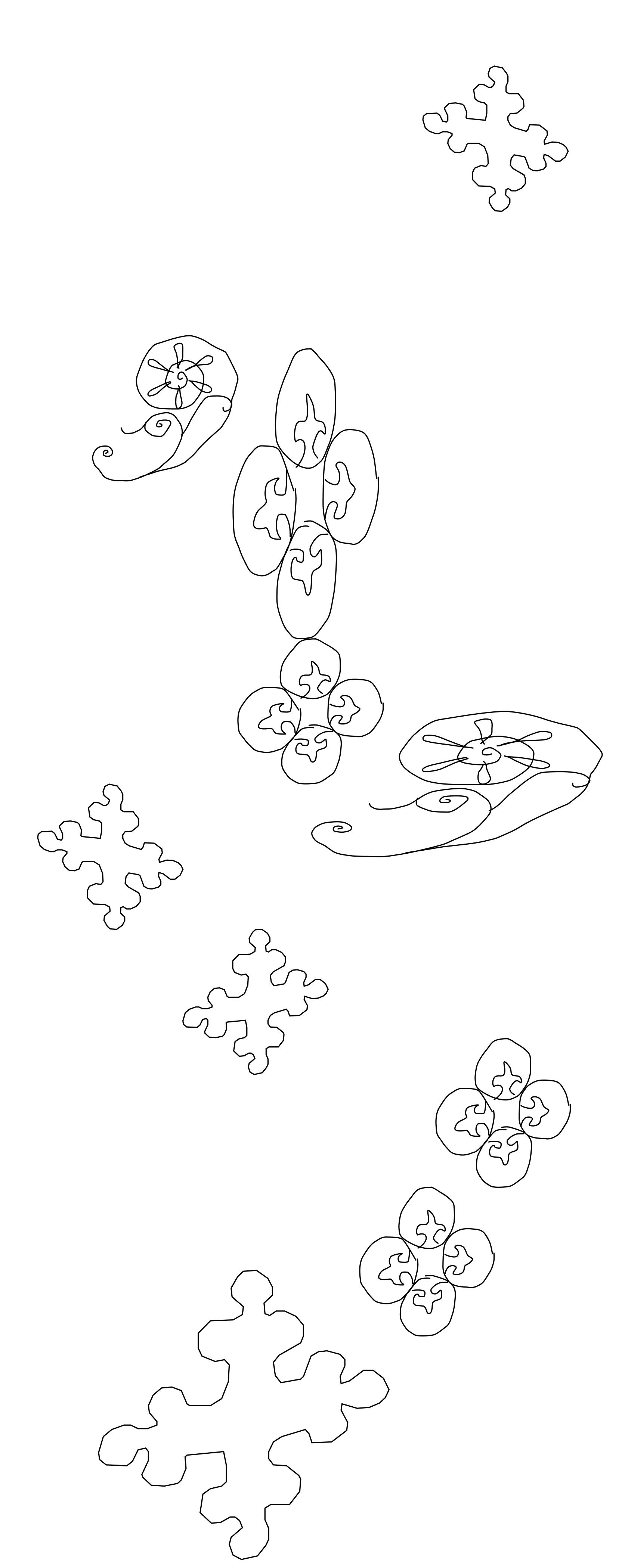
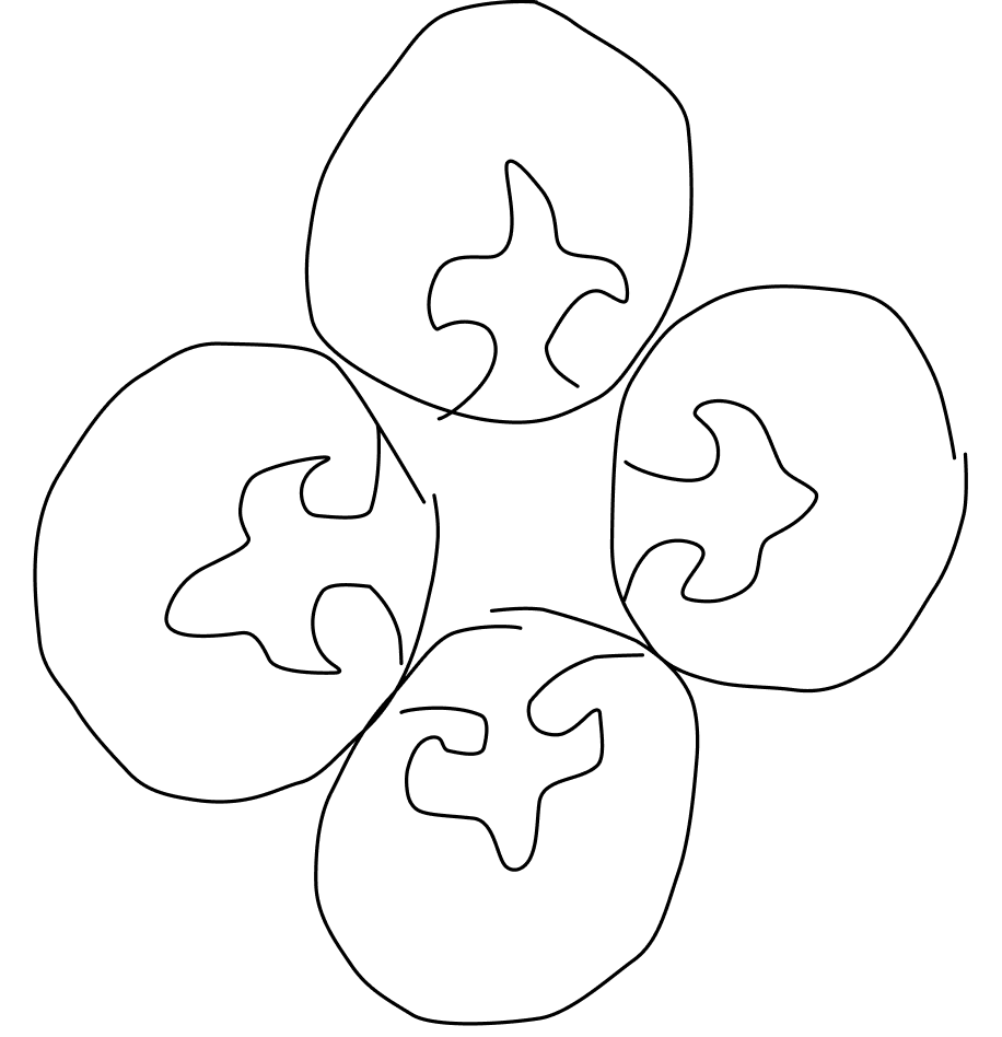
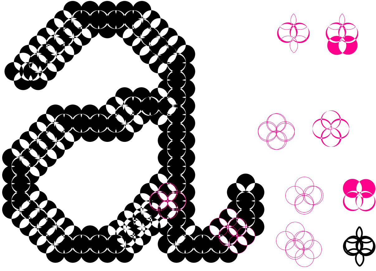
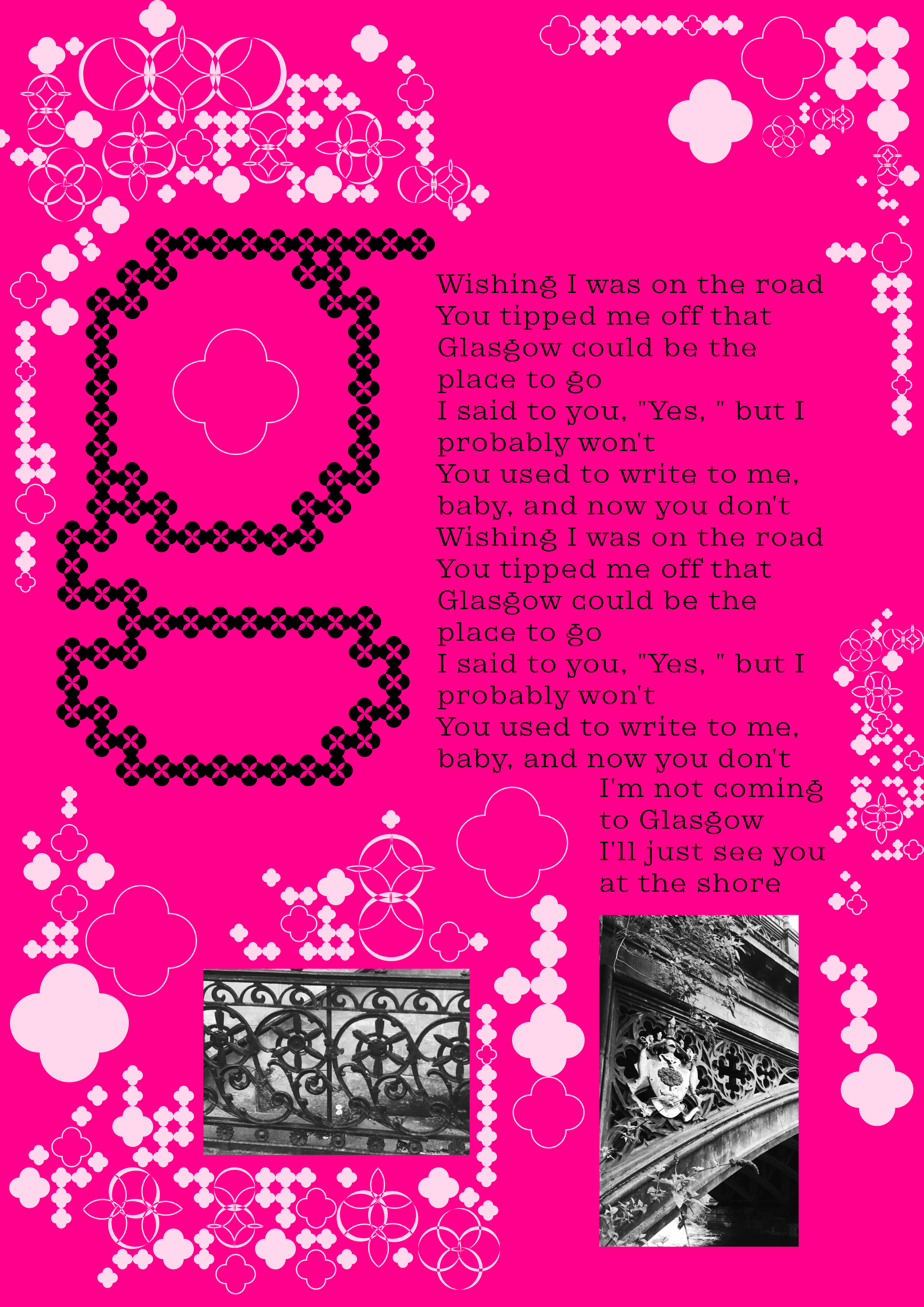
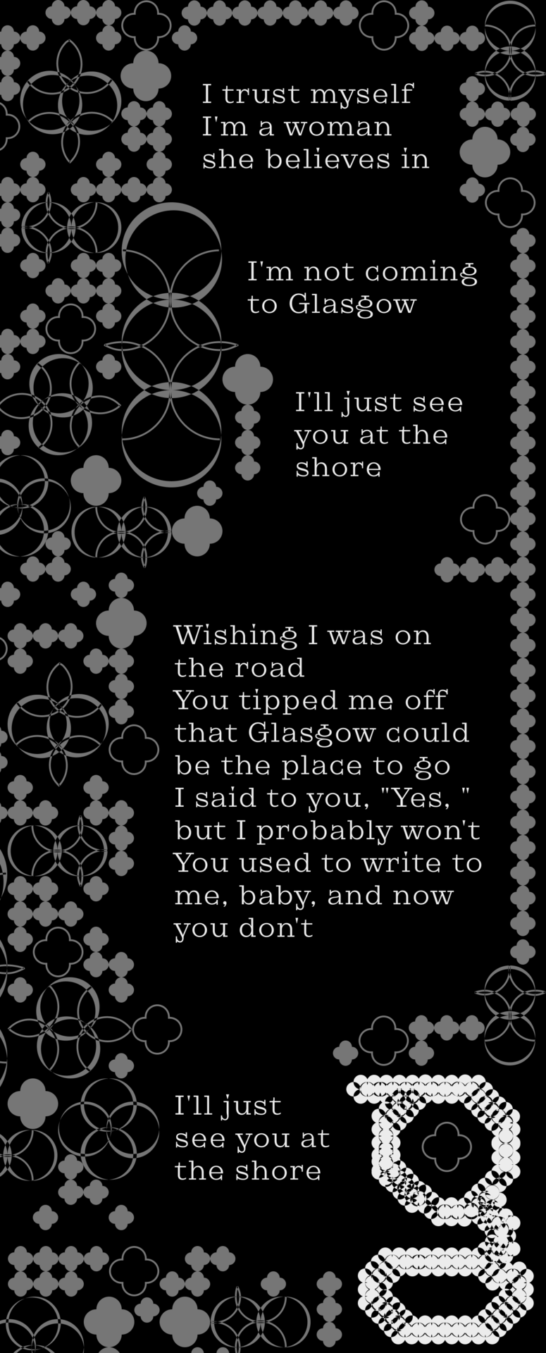
the pattern is based on gothic ornaments I noticed while strolling through the city on google maps.
some of the shapes are traced from the font "Flor De Ruina" designed by Felipe Sanzana.
i placed the individual shapes in a grid, according to the principle of a recursive algorithm.
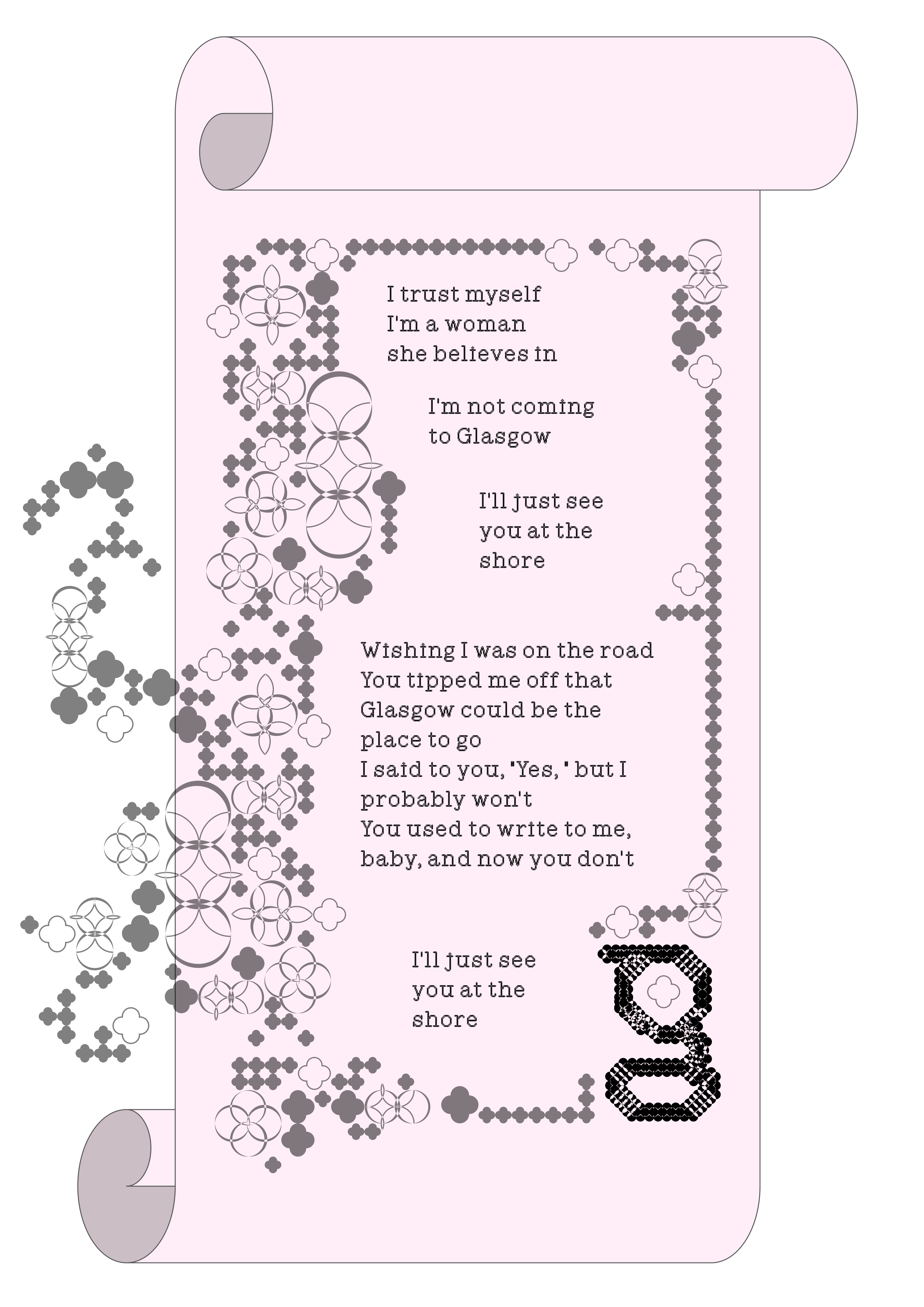
I incorporated the song lyrics into the visual identity.
I found it funny that the protagonist doesn't want to go to glasgow.
I decided to use that as a bait to make people actually want to go visit glasgow - contrasting the image of rough industrial streets with baroque-esque drama.
main takeaways
glasgow is not a popular city to visit.
it's raw culture, financial instability & socioeconomic inequality is very visible.
BUT!
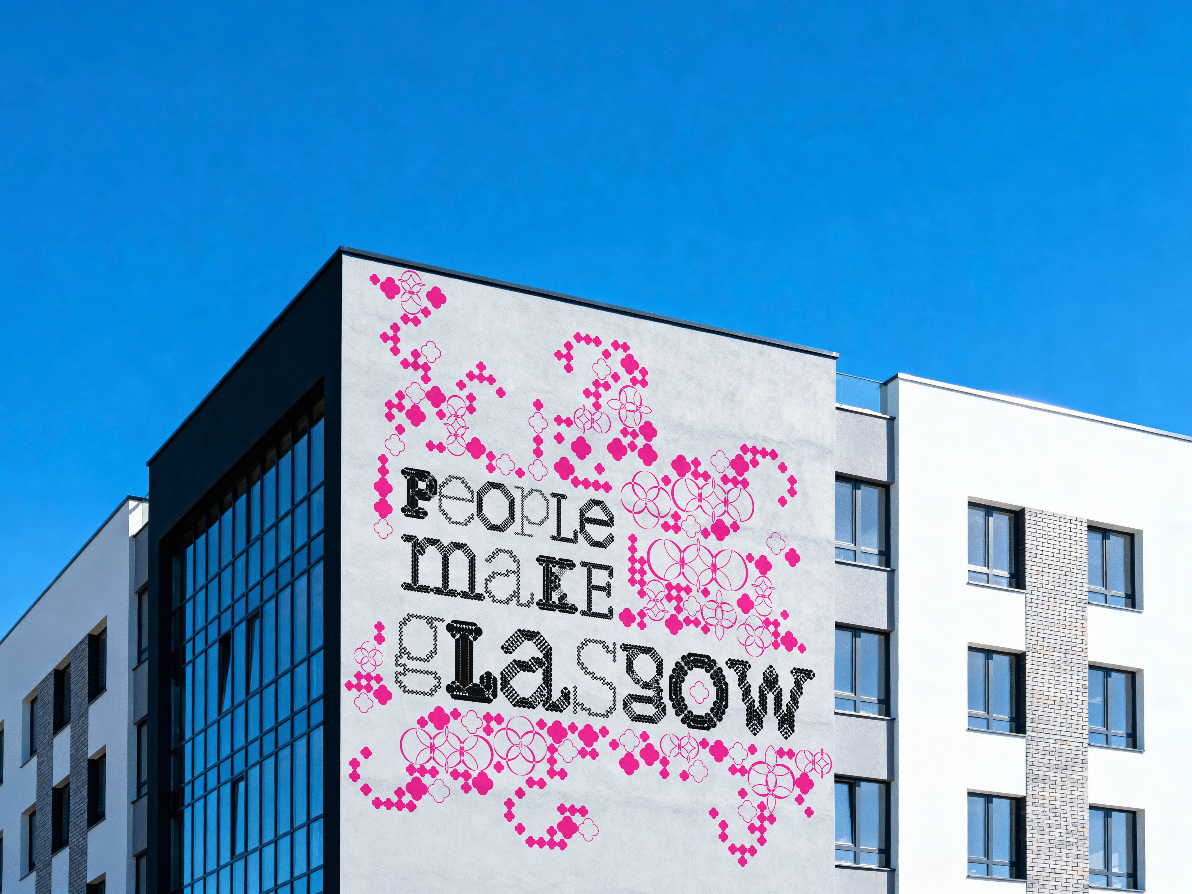
youth culture, & the persistence of the people, is coloring the ever so crusty brick walls - a huge inspiration to me!
I can't lie, I'm coming to glasgow. ;)